"Wise men say, 'Forgiveness is divine, but never pay full price for late pizza.”
Identity System and Collateral
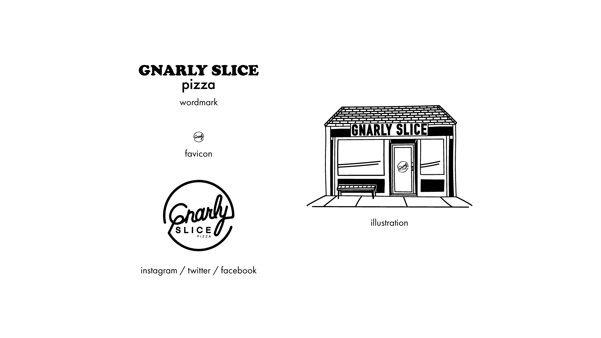
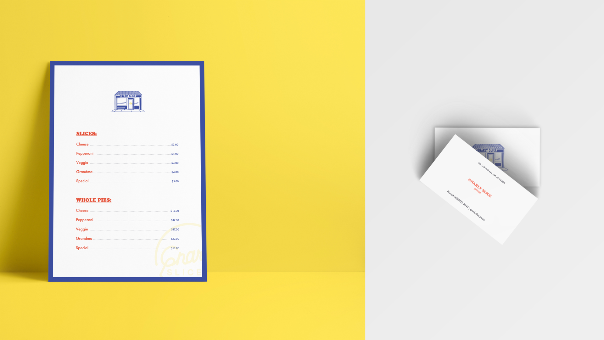
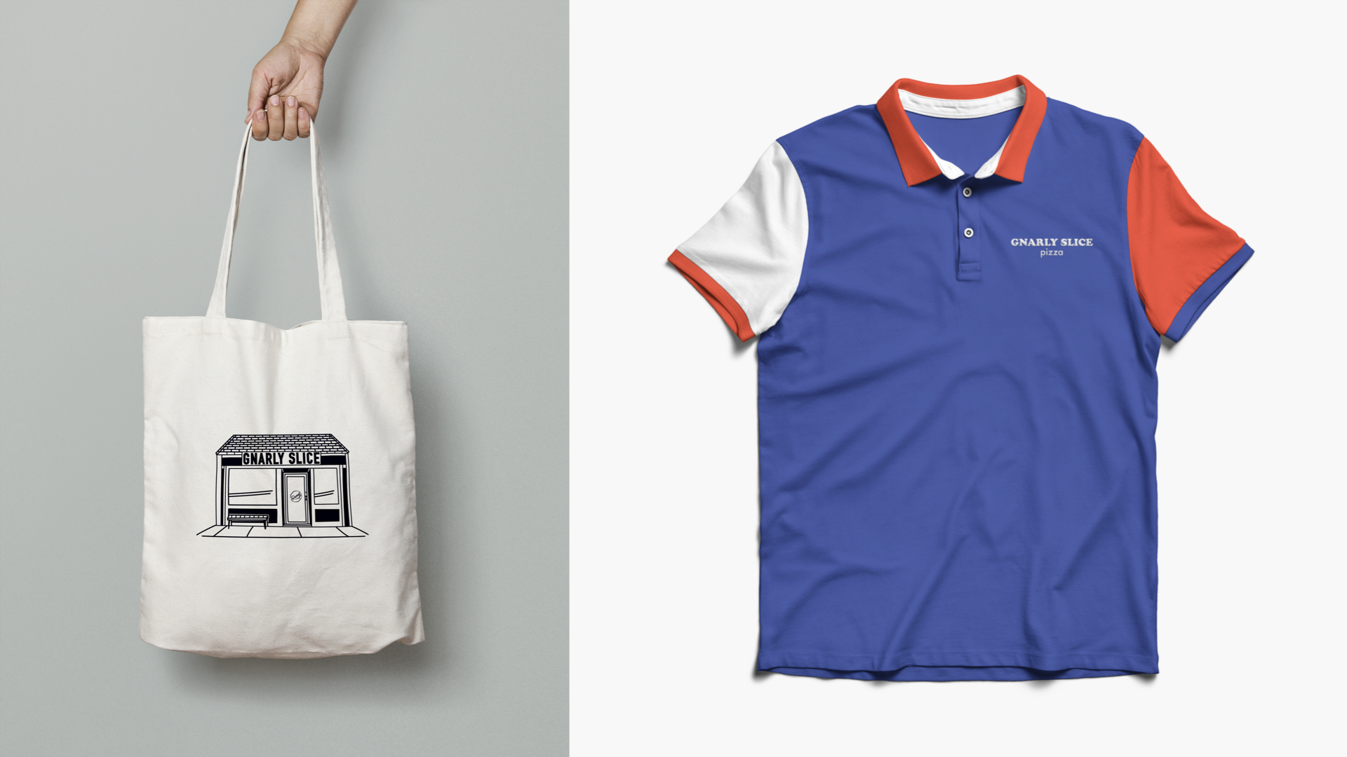
Logo System | Typography | Illustration | Social & Printed Collateral
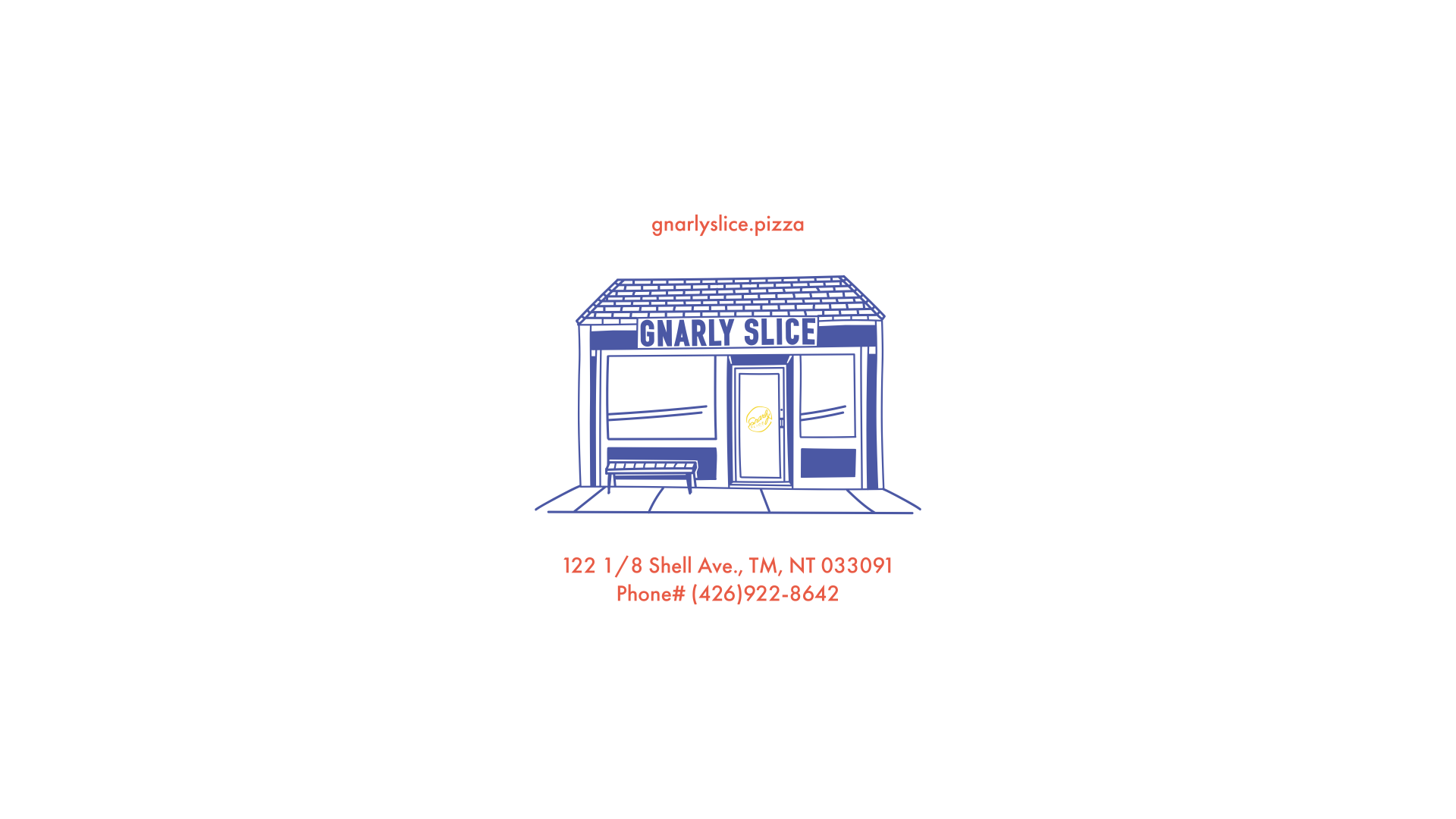
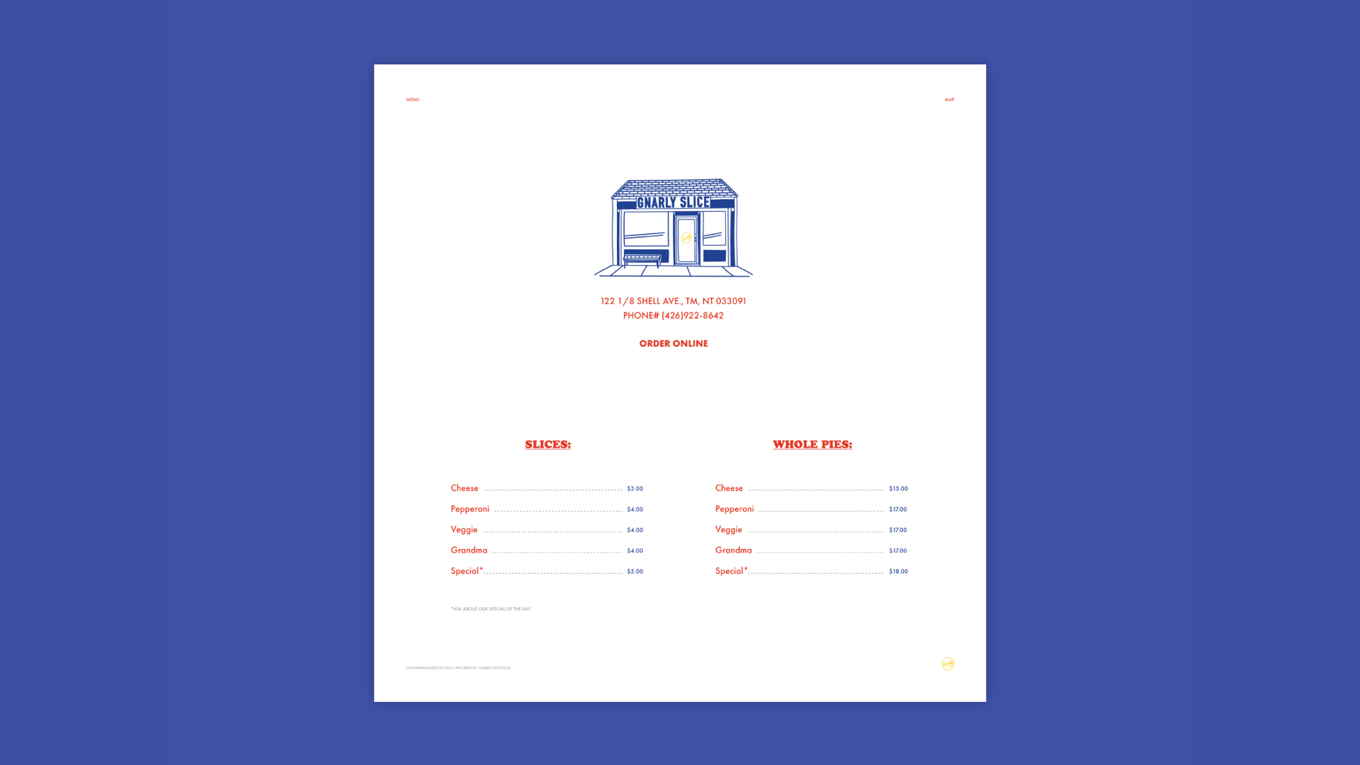
An independently owned and run pizzeria, Gnarly Slice's focus is simple; A good slice can make a great memory. Born out of a childhood obsession, the good ol' boys at GS are meticulous. Food brings people together and at GS, pizza is king. A 12-hour fermented dough, mom's "to-die-for secret recipe" tomato sauce, premium buffalo mozzarella; yes, we said buffalo; fresh veg and the best meats and cheeses the old Italian deli on the corner can give. Oh and don't forget the olive oil.
So come F* get some.
--
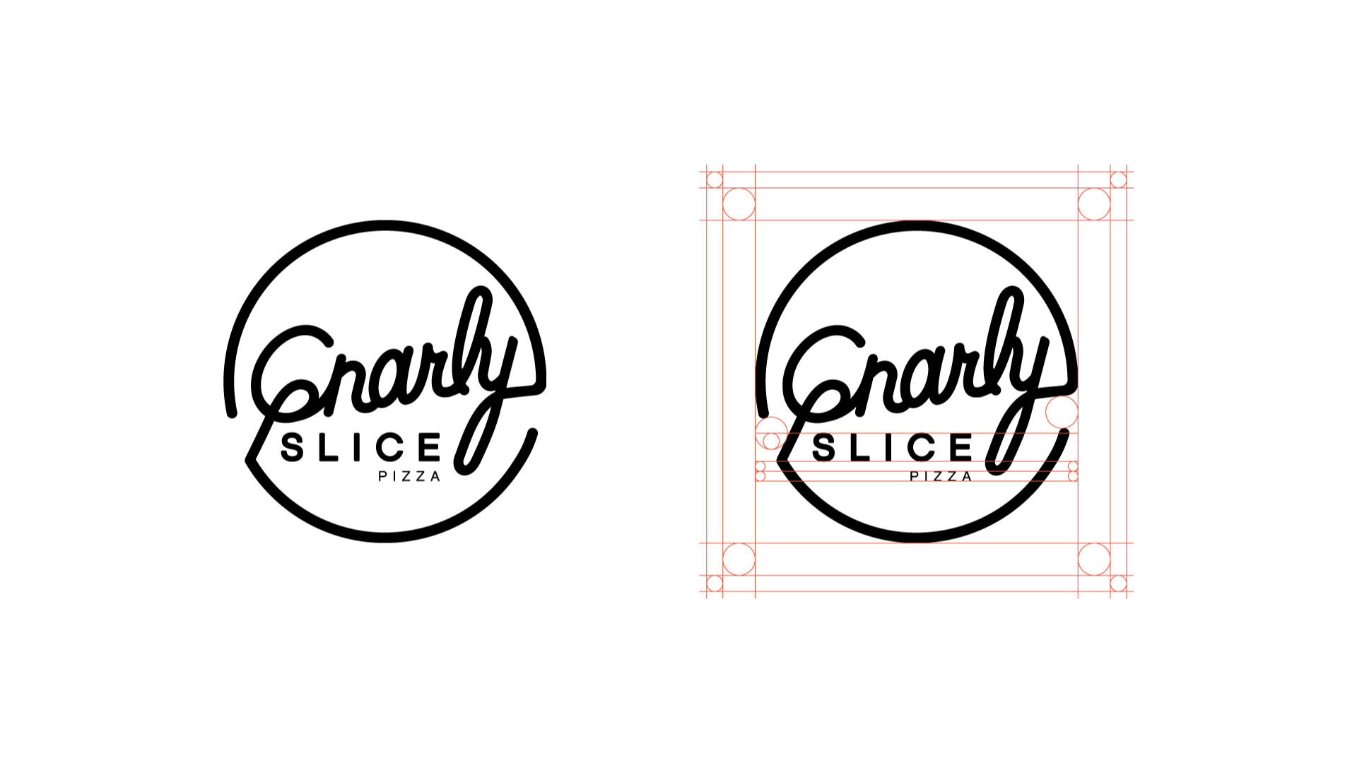
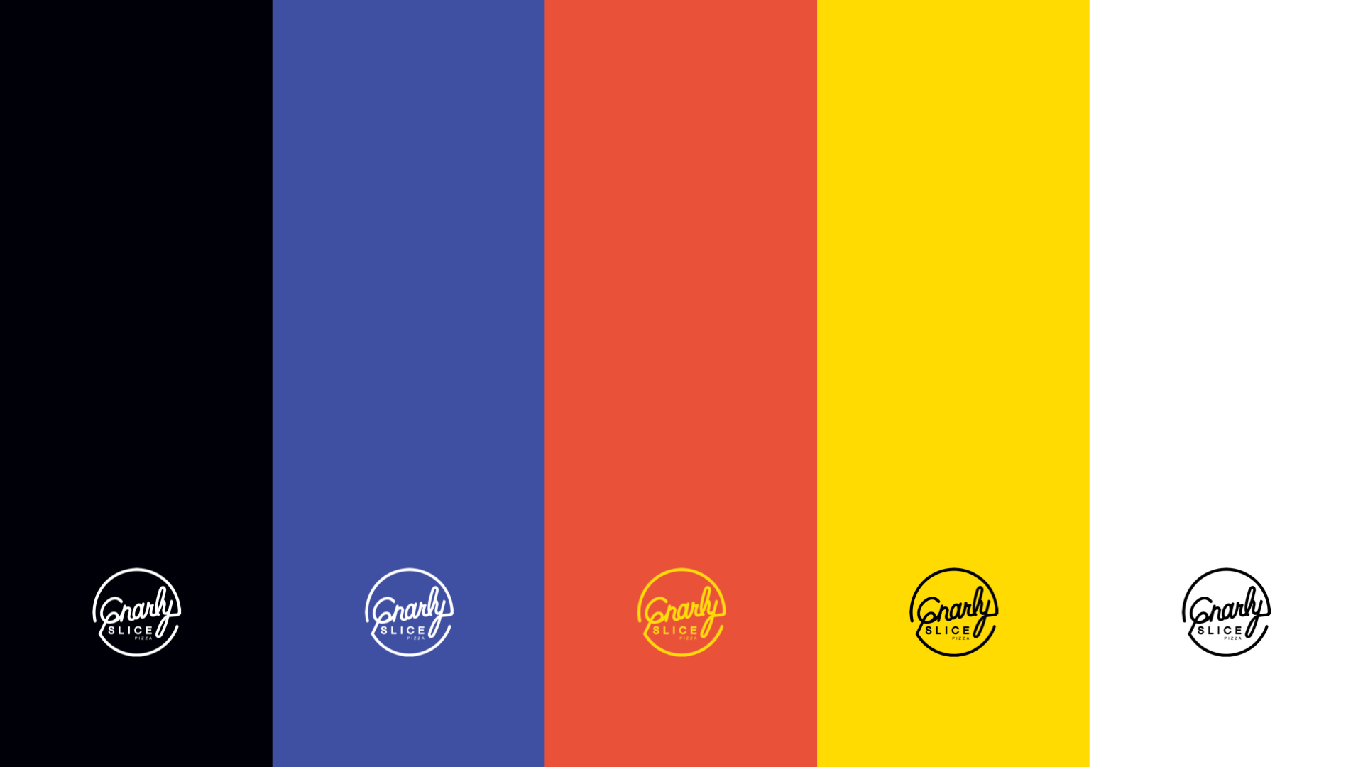
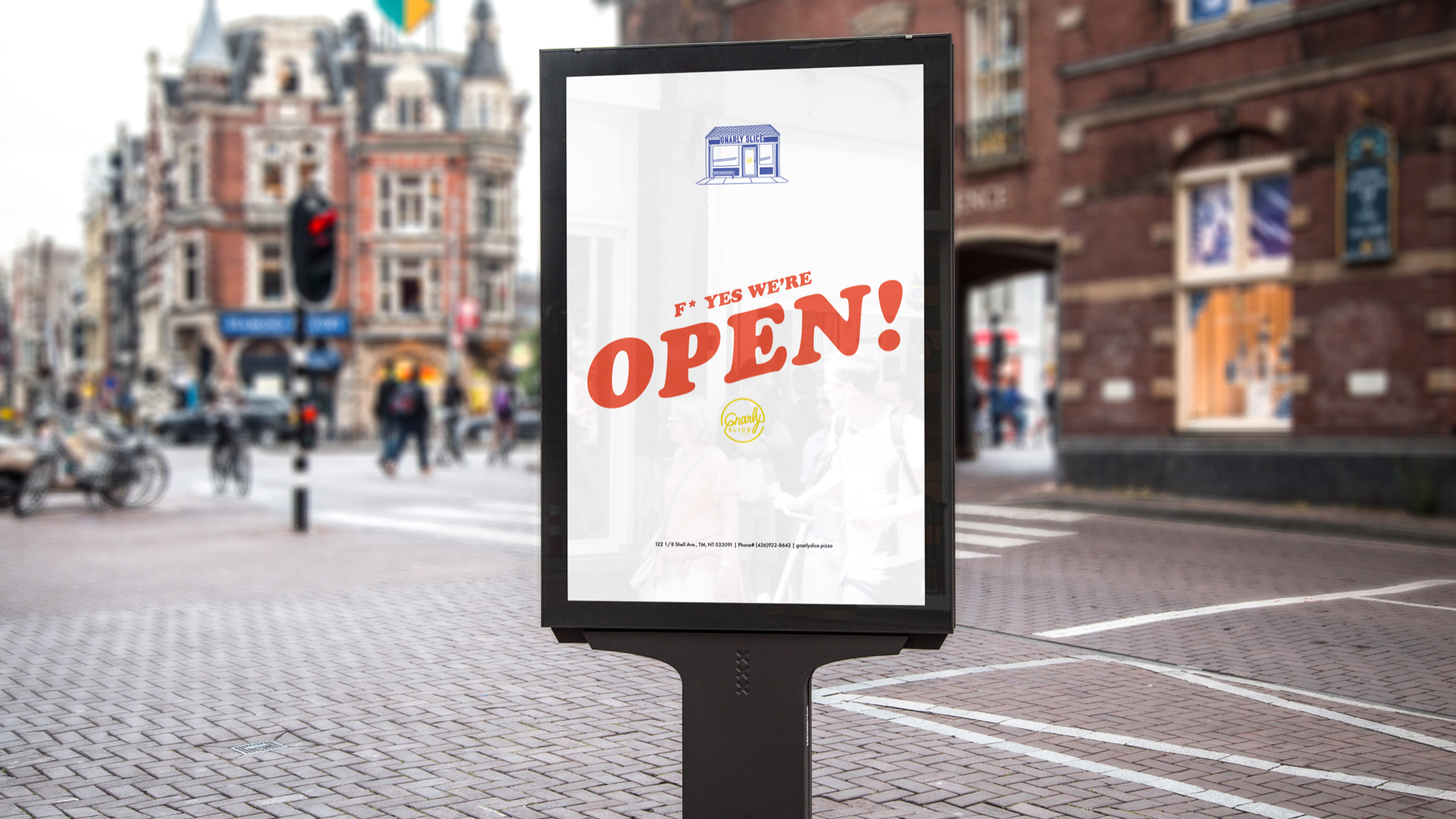
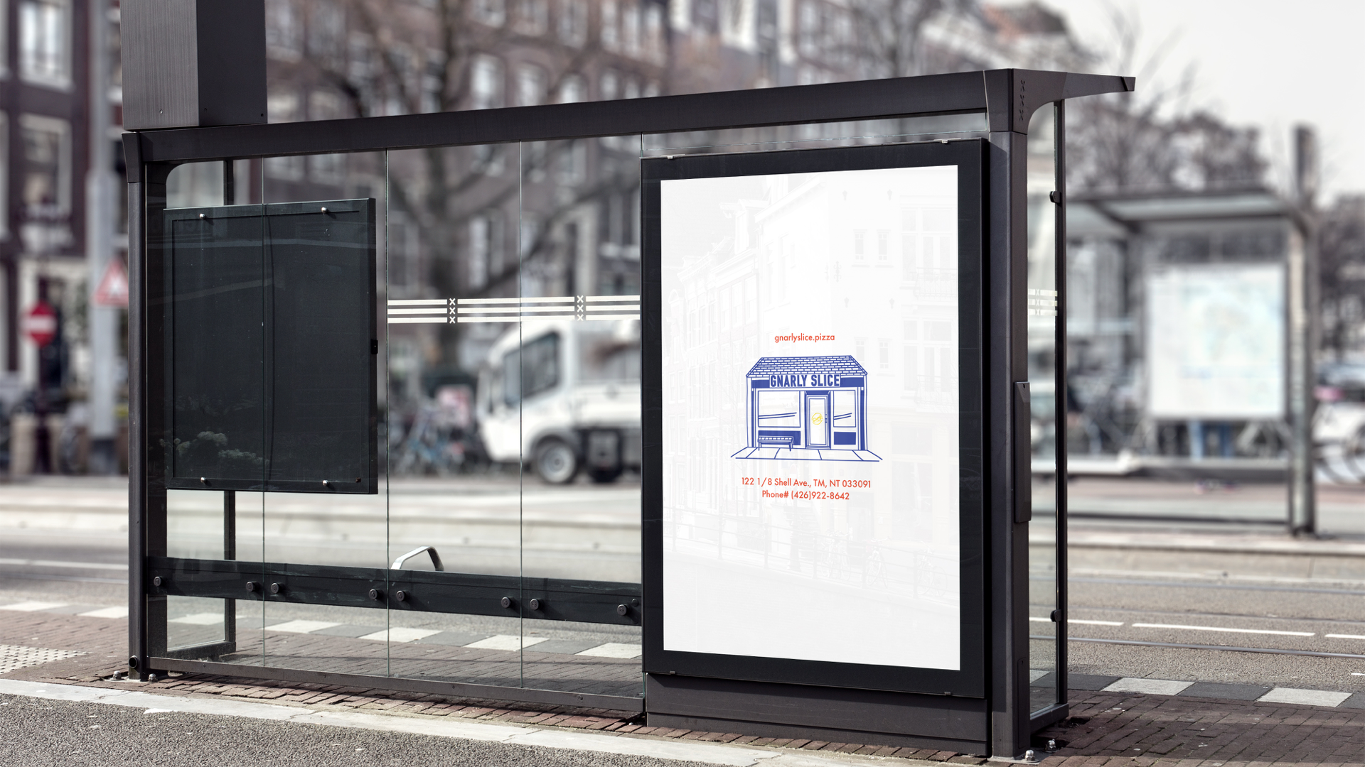
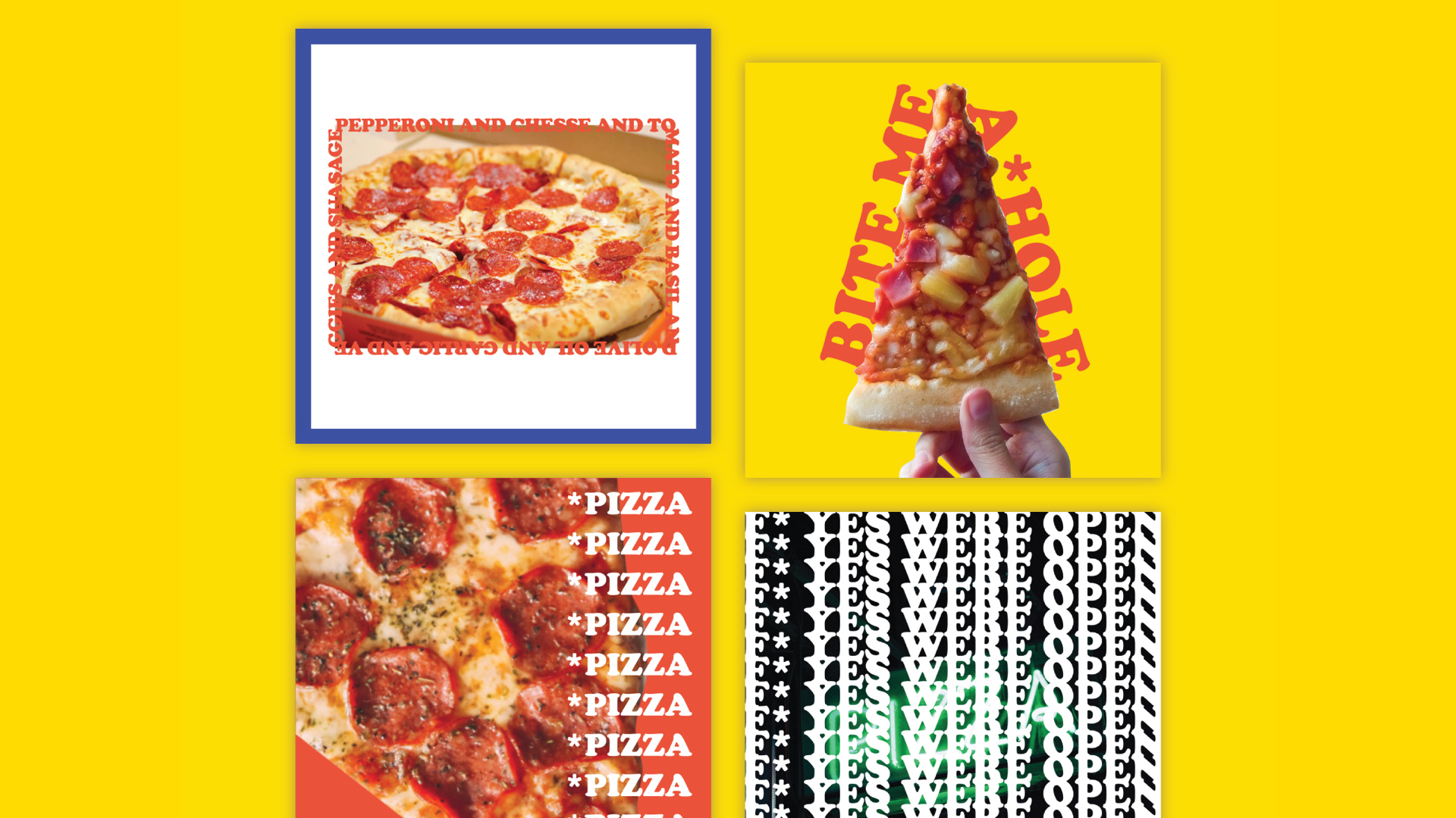
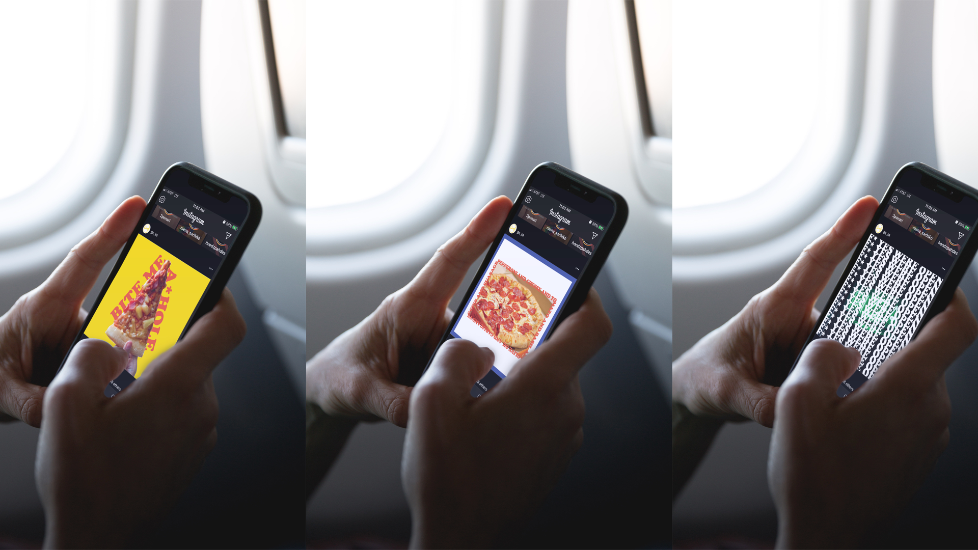
When we started this, we knew our solution had to be approachable, strong, playful, and practical with a visual system that stands out through its simplicity and emotion. Taking heavily from the pizzerias of our youth and inspired by those rad neon signs above the place, we created an identity and brand that revolves around simply styled graphic elements with a modernist punch.
GS Brand Ethos:
A good slice can make a great memory | We make pizza, plain & simple | We're a fellowship of passionate fans | We champion substance and quality


THANKS FOR WATCHING